Sunday, November 16, 2008
Tutorial: Simulate Type-Ahead Using Axure
I created this audio-visual tutorial a few months ago. Several people have asked me since to post it in this blog. Here is the link: http://www.artandtech.com/type-ahead.html
Saturday, October 11, 2008
Real-Time, Quantitative Capture of User Response to Streaming Content
1. Introduction
Usability studies utilize both qualitative and quantitative methods for capturing user response to the user interface that is being tested. We can measure mouse-clicks, time on task, task completion rates and other valuable data. We can also collect verbal feedback related to ease of use, visual design, layout and other subjective responses. The processing of collected verbal data is expensive because recordings have to be transcribed, tagged and often edited for readability. This is a labor intensive process and if the testing is done with users who talk different languages, translation is also required. Moreover, even when interviews are carefully scripted and prompts are consistent, response are often difficult to reconcile: Participant's answers can be inconsistent, vague, and generally difficult to analyze and interpret.
Verbal feedback is also used to capture participants' response to streaming content and to gage level of engagement with that content. Typically the tester pauses the media and prompts the participant for her or his opinion. The benefit of this method is that the feedback is contextually related to the content which had just been displayed and is fresh in the mind of the respondent. The disadvantage is the labor intensive post session processing and interpretation of the information gathered. Alternatively, a user can be given a questioner at the end of the streaming content. The benefit of a questioner is that it is easier to process and measure the responses, but the drawback is that the participant is not likely to recall in deep detail their response to content or their sense of engagement with content that was displayed minutes ago.
This paper describes a method I developed to capture in real-time participants' response to streaming content as well as their engagement levels throughout the presentation. The key benefits of this method are:
 You need to create an image that will be used to capture the user's responses to content and the user's engagement level. This graphic can be as fancy as you wish, but my suggestion is to keep it simple and remember that the main event on the page is the streaming content, not these graphics. Here is an image I typically use:

The image is divided into 2 sections:

The second approach makes it possible to capture user's response to any streaming content, on any site. This scenario works when:
How it Works:
Since a measurement bar graphic cannot be used, I suggest a low tech solution - drafting tape. The simplest method: Apply a strip of drafting tape directly to the monitor, above the clip you want to test. With a sharpie, write 'Content' in the top-center, the number 1 on the left, 2 in the middle and 3 on the right. Apply a second strip on the bottom of the clip, write 'Engagement' and the 3 numbers.
The strips help guide the user to well defined area of the screen where you want them to click. The strip is semi-transparent, so the user can see the mouse pointer then they click, and since they click in areas that are not part of the content object, the streaming is not interrupted by the clicks. When you view the recorded session later, the drafting tape strips will obviously not be there, but since you know their meaning - the clusters of clicks on top and bottom of the clip, and to the left, middle and right - will help you collect the relevant data as effectively as if there was a graphic there. Once this section of the study is done, you can peel the tape off the screen an move on to another topic.

While the example above works best for a 3 rating system, you can setup a more granular system used the left and right sides of the box. However, keep in mind that you want to keep it simple, and that adding too much tape around the clip may mask too much of the screen. Also think about the accuracy when logging the
What you need:
3. What's next?
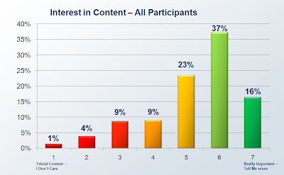
Once you capture and tag the sessions, it is possible to translate data to valuable information. There are many interesting ways to slice and dice the data, well beyond the scope of this document. However, as you can see in the graphs below, aggregation of session data make a compelling story about response to content and level of engagement to existing or proposed streaming media. makes helps present to stakeholders important analysis and help develop strategies

------------------------------------------------------------------------
* Can be used with Morae 2 and 3.
Usability studies utilize both qualitative and quantitative methods for capturing user response to the user interface that is being tested. We can measure mouse-clicks, time on task, task completion rates and other valuable data. We can also collect verbal feedback related to ease of use, visual design, layout and other subjective responses. The processing of collected verbal data is expensive because recordings have to be transcribed, tagged and often edited for readability. This is a labor intensive process and if the testing is done with users who talk different languages, translation is also required. Moreover, even when interviews are carefully scripted and prompts are consistent, response are often difficult to reconcile: Participant's answers can be inconsistent, vague, and generally difficult to analyze and interpret.
Verbal feedback is also used to capture participants' response to streaming content and to gage level of engagement with that content. Typically the tester pauses the media and prompts the participant for her or his opinion. The benefit of this method is that the feedback is contextually related to the content which had just been displayed and is fresh in the mind of the respondent. The disadvantage is the labor intensive post session processing and interpretation of the information gathered. Alternatively, a user can be given a questioner at the end of the streaming content. The benefit of a questioner is that it is easier to process and measure the responses, but the drawback is that the participant is not likely to recall in deep detail their response to content or their sense of engagement with content that was displayed minutes ago.
This paper describes a method I developed to capture in real-time participants' response to streaming content as well as their engagement levels throughout the presentation. The key benefits of this method are:
- Capture in real-time users' response to streaming content such as web seminars, tutorials and demos, where the user interface itself plays a smaller role in the interaction
- Significantly lower the time labor costs associated with processing the feedback, which may help budgeting for larger samples.
- Capture response to streaming content by setting your own test pages or from any website or application.
The method involves the use of TechSmith's Morae*, which is currently the only commercial, out-of-the-box software for usability test. The method leverages Morae's capability to captures, among other things, mouse movement and mouse clicks.
2. Methods
2.1 Create your own test page/s
The first approach is to create your own test pages. This scenario works well when you:
- Wish to hide the tested content from the associated company's identity by isolating it from the rest of the company's site and the site's URL.
- When you are testing several draft variations of the content, don't want to bother site admins with helping you post the stuff and need to run it locally off your machine.
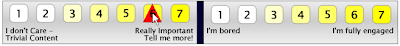
Some technical skills involving the creation of a standard web page are required for setting up your own test pages, but a typical page is really simple, composed of the embedded streaming content - typically a Flash file (So you will need the SWF file), and a single graphics that is used to capture the feedback for content and engagement. See image 1 below:


The image is divided into 2 sections:
- Left side - Response to content. A rating scale from 1 to 7, with 1 being "I don't care -- trivial content" to 7 being "Really important -- Tell me more!"
- Right side - Engagement level. A rating scale from 1 to 7, with 1 being "I'm bored" to 7 being "I'm fully engaged"
Morae Study Configuration
To maximize efficiency of logging sessions in Morae Manager, it is best to prepare the study configuration in advance. See image below:

For a 7 based rating scale, prepare 7 markers for content and 7 markers for engagement and label them Content 1, Content 2, etc. Change the letter association for the markers to a sequence that will make it easy for you to use shortcut during the logging. Finally, assign a color to all content markers, and a different one to all engagement markers. This different colors will provide a clear differentiation once you finish placing all the markers.
How it Works:
Ask the user to click the relevant ratings on the content and engagement bars as the content streams. Ask the user to click as many times as makes sense. Morae captures mouse clicks on the bars, which are easy to see and log. (The red triangle in the image below is generated by Moare Recorder during the session.)

In logging the session it is possible to identify with a high degree of accuracy which section of the streaming content the participant rated, and of course, the assigned value. With a big enough sample rate you can get a good insight into participants opinion about the content -- both narration and visuals, as well as their engagement level throughout the streaming.
Some production tips:
- For the screen to be aesthetically pleasing and professionally looking, I adjust the width of the image so that it is the same as the width of the embedded content I'm testing.
- The buttons on the bar should be clear and easy to see, and easy to click on.
- The labels should be clear and easy to read
- This is a static image - no need to create mouse-over states.
- Keep to the minimum the number of shades and colors used for the buttons: The participant needs to focus on the media, not the buttons, so minimize visual overload.
- Differentiate between the low and high scores. I have a gradual shift from White (1) to Yellow (7)
- Make sure you have good speakers so that the participant can hear clearly the narration.
The second approach makes it possible to capture user's response to any streaming content, on any site. This scenario works when:
- You want to test content that is on a production site but you don't have the media file locally
- You want to capture response to a section of a competitors site
- You want to capture response to streaming content but are also conducting a traditional usability test for the site (navigation, workflow, tasks and so on)
- For some reason you can not use self-created test pages.
How it Works:
Since a measurement bar graphic cannot be used, I suggest a low tech solution - drafting tape. The simplest method: Apply a strip of drafting tape directly to the monitor, above the clip you want to test. With a sharpie, write 'Content' in the top-center, the number 1 on the left, 2 in the middle and 3 on the right. Apply a second strip on the bottom of the clip, write 'Engagement' and the 3 numbers.
The strips help guide the user to well defined area of the screen where you want them to click. The strip is semi-transparent, so the user can see the mouse pointer then they click, and since they click in areas that are not part of the content object, the streaming is not interrupted by the clicks. When you view the recorded session later, the drafting tape strips will obviously not be there, but since you know their meaning - the clusters of clicks on top and bottom of the clip, and to the left, middle and right - will help you collect the relevant data as effectively as if there was a graphic there. Once this section of the study is done, you can peel the tape off the screen an move on to another topic.

While the example above works best for a 3 rating system, you can setup a more granular system used the left and right sides of the box. However, keep in mind that you want to keep it simple, and that adding too much tape around the clip may mask too much of the screen. Also think about the accuracy when logging the
What you need:
- A 1" 3M™ Scotch® 230 Drafting Tape - this tape sticks to the screen but is easy to peel off. You can get it in any office supply store.
- Ultra or extra fine tip Sharpies - I use a Blue for the content strip , Black for engagement strip and red for the numbers. (Avoid using Red and Green for labels because they carry an inherent association for bad (Red) and Good (Green), which may confuse the user.
- Small scissors (to cut the tape nicely)
- Lens cleaner solution to wipe the screen after peeling off the tape
- Don't be sloppy: Cut the strips with scissors. If you have to tear the tape, fold about 1/2" on each side to give the strip edges and straight edge.
- Apply the tape as horizontally as you can (Leveler is not needed...)
- Demonstrate to the user how you want them to act during the recording and make sure they are comfortable with the mouse going 'under' the tape while they click it.
3. What's next?
Once you capture and tag the sessions, it is possible to translate data to valuable information. There are many interesting ways to slice and dice the data, well beyond the scope of this document. However, as you can see in the graphs below, aggregation of session data make a compelling story about response to content and level of engagement to existing or proposed streaming media. makes helps present to stakeholders important analysis and help develop strategies


------------------------------------------------------------------------
* Can be used with Morae 2 and 3.
Friday, September 5, 2008
The Analog Threat
Google's new browser has a privacy mode called 'Incognito'. In this mode, sites open in a new window and do not "...appear in your browser history or search history, and they won't leave other traces, like cookies, on your computer after you close the incognito window."
Google warns users that Going incognito doesn't affect the behavior of other people, servers, or software. Be wary of:
- Websites that collect or share information about you
- Internet service providers or employers that track the pages you visit
- Malicious software that tracks your keystrokes in exchange for free smileys
- Surveillance by secret agents
These are all sophisticated electronic transgression methods and they sharply contrast the last point:
- People standing behind you
This point is needed, perhapse, because, to quote Voltaire "Common sense in not so common". Interstingly, this is the only threat most users CAN do something about if they pay attention...

Thursday, January 10, 2008
SOA Predictions for 2008

Dr. Jerry Smith just published his SOA predictions for 2008. Certainly, the domain of user experience design must become an integral part of SOA. Perhaps at some large companies this synthesis already takes place. But it appears that there is still a massive gap between the front and back ends. Given that simulation tools are just emerging (See Axure), and Visio wireframes still dominate the UEA practice, I doubt that a lot will change in 2008 - The gap in maturity is just too wide.
Still, I would like to append a question to Jerry's predictions:
Will companies finally realize that SOA must also incorporate UEA (User Experience Architecture)? Let's revisit next year.
Tuesday, January 1, 2008
Basic Search
 The definition of ‘Simple’ requires a whole discussion…but typically, simplicity can be afforded by reducing the amount of pre-requisite knowledge the user needs to have and the number of decisions the user needs to make before taking action.
The screenshot below provides a good opportunity to discuss a number of usability issues to consider when constructing a 'Simple Search'.
1. A text disclaimer such as the one here: “For more search options, use the advanced search below” is more effective if placed at the footer of the box, after the user had an opportunity to review the capabilities of this search control.
2. The actual search field is small and does not indicate the ability to enter a phrase. Entering more than a single keyword will hide part of the term. Finally, the label ‘Enter Keyword(s) which implies discrete words, conflicts the option to check ‘Exact phrase’ which suggests the ability to enter more than a keyword.
3. The option to ‘Restrict by Type’ may confuse the user. Typically, from a user’s perspective, ‘Full Text’ suggests WHERE the search is taking place – on the full texts of the documents. Here, the full text is presented as a type of data, which is correct, but also not very intuitive. Finally, many users may still not know what metadata means. (certainly, users of a ‘simple search’ are not quite the audience that should be expected to know. Note that by default this section is collapsed. The user needs to click and see the choices. Given that there is a default (which is always good), why not show the default, and clicking that will allow the user to see the other choices and make a change. Better yet, consider eliminating this choice all together.
4. Again, the user needs to make a decision about option that may not be clear, or, appear too restrictive. It is quite likely that the user would like to see all the details, so this choice is more appropriate in the display of the result set. Note that by default this section is collapsed. The user needs to click and see the choices. Given that there is a default (which is always good), why not show the default, and clicking that will allow the user to see the other choices and make a change. Better yet, consider eliminating this choice all together and using it in the search results page.
First published at "http://fedora.info/wiki/index.php/Basic_Search_UI"
Subscribe to:
Posts (Atom)


